We are going to be moving to the new UI where you have made trackunit manager look more and feel more like classic. my question is after years of manager looking as it is and why change it? Also why change the UI to look like classic but not change how the new 2.0 access control to be more ‘easier’ ‘less clicks’ ‘less clunky’ like classic also? I think that access control 2.0 is good but there are way too many clicks and seems the flow isnt as smooth as classic. Maybe its what im use too… but worth asking. Biggest issue with 2.0 layout is you can not lock machines by groups/ zones etc. You have to go into every single machine to lock it, when before you could filter by group/ zone etc and work through them clearly on the ‘setting’ screen you can not do this is the ‘fleet’ screen or anywhere else that im aware of. Happy to discuss…
many thanks
Thanks
Natalie
Page 1 / 1
Hi @nataliejh - thank you for posting and welcome to the community! I moved your question to this group for discussions around new UI - the right people will see it here.
Thanks,
Stine
Hi @nataliejh ,
Thank you for reaching out with your questions and feedback – it’s much appreciated!
At Trackunit, we’re constantly iterating to improve the experience for all users. The changes in Manager aim to improve usability and streamline workflows, ultimately helping you achieve value faster with fewer clicks overall. The goal is not specifically to make it similar to Classic, but I do agree that with the changes to the map there are a couple of similarities.
I also understand your concerns about Access Control 2.0, particularly regarding the number of clicks and the workflow differences compared to Classic, and regarding locking the machines in a faster way. Our Product Manager for Access and Safety, Anders, will follow up in this thread to address your points and share more insights.
Once you’ve transitioned to the new UI, I’d love to hear your thoughts and feedback. Feel free to continue the conversation here – it helps us make Manager even better!
Best, Jonas Goth
Hi Natalie,
Thank you for bringing this up. In the Access Management team here at Trackunit we acknowledge that locking/unlocking multiple machines can be a cumbersome process. However, it is possible to filter the fleet list on groups. Here's how:
Click the “Assets” tab
Click the “Filters” button located left of the search field
Select one or more filters you want to apply. Groups are first on the list, and as a new thing, you can even pick multiple groups)
This will produce a table similar to the one you mention in the Classic settings, making it possible to spot the machines in that group with Access Management (Access Management Mode column), you can then click the individual assets you want to change the AM setting for.
Have a nice day,
Anders Ostergaard
Thanks both Anders and Jonas.
I have just tested the method you have suggested Anders and this is a work around, but still too many clicks. i just feel we are creating turning on access control into a longer process. i don't mean to be negative I'm just being honest. I don't see how this is making the customers life easier moving to a more complex way of working.
@Jonas Goth I've had the new UI for nearly a week now. The UI change is positive as you get more data on map view which is fantastic.
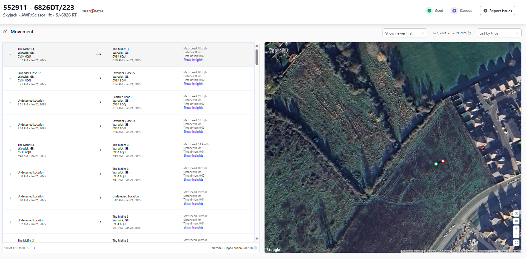
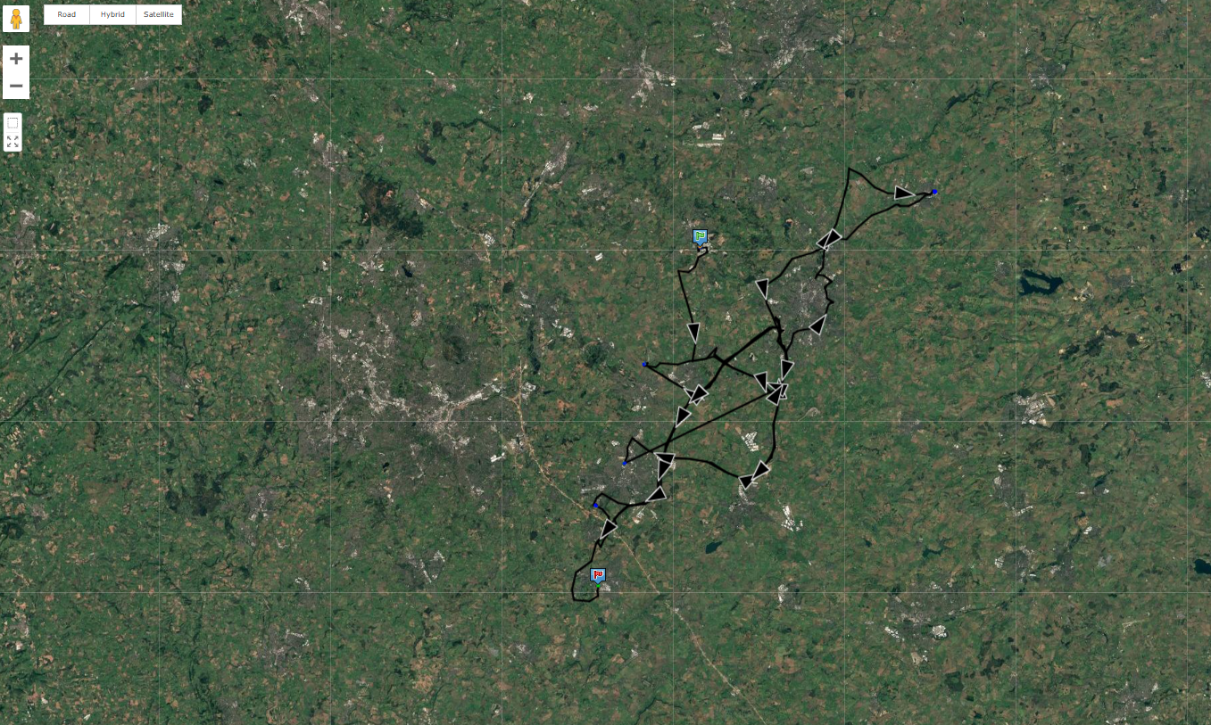
I find the Movement screen need some work still. It would be nice if the map was bigger on the screen (i know you can have full screen, but i feel there is a lot of wasted white space on the actually movement table). Also when search a large date range would be helpful if shows the full journey on the map, as i find it temperamental. Please see attached the comparison of the same machine and same date search. the classic map shows the full journey straight away, you need to go to each page to see the locations on new manager. Also trips doesnt show the same. Sorry im picking on movement screen and maybe not for this chat… but im aware there were some changes as part of UI update from what i was trained
All in all great update to the UI.
Hey @nataliejh,
Thanks for sharing your thoughts on the Movement screen Your points are very much in line with our planned improvements
Updates that will already be available within this quarter:
- Improved accuracy of Trips / GPS locations (updated algorithm that includes turn detection for supported units)
- KPIs for total duration and total distance driven in the selected timeframe
- Better structure and ease of use for the list of trips (displayed left to the map)
- A timeline slider to navigate quickly through the map points in chronological order
- Options to turn geolocations, connections and a new heat map visualization on/off
After those we’ll tackle:
- Showing movements on the main map (accessible through main navigation)
- Increasing asset movement screen map size
You also mentioned the full journey on the map. In fact you can already display this by clicking on “List by trips” in the top right corner and change it to “List by Geolocations”. This will show all geolocations within the selected timeframe connected in chronological order.
Feel free to let us know if that leads to the desired view.
Best regards
Pascal
Thank you, sounds fantastic @Pascal Schrepfer also sounds like you have it all in hand.
I will stop posting my views on here now, but if ever you want anything testing or input from a user point of view please do not hesitate to contact me.